Take More Professional Screenshots in Seconds with Screely
I’m always sharing screenshots!
They’re often quick screenshots of a graph on Google Analytics or something on a web page that I want to share with a friend or client. They’re not pretty or appealing. Now, not all screenshots have to be special. Sometimes though, I want to make something I share pop.
I’ve tried to make screenshots more appealing by taking whole window screenshots with the MacOS built-in screen. It was better but not unique. I have also taken my time to frame a screenshot on a background via Figma or a Powerpoint, but that was always a time-consuming effort.
Then I came across a tweet that had an appealing screenshot.
My best day of followers ever today. It’s not huge, but it’s nice to see some momentum 🚀
Hey new followers! I’ll be tweeting about my progress building @indiebitespod into a full-time income this year 💸
Analytics from https://t.co/A03dxjRqB3 made by @dr 📈 pic.twitter.com/cRcg1JnWaA
— James McKinven (@jmckinven) January 4, 2021
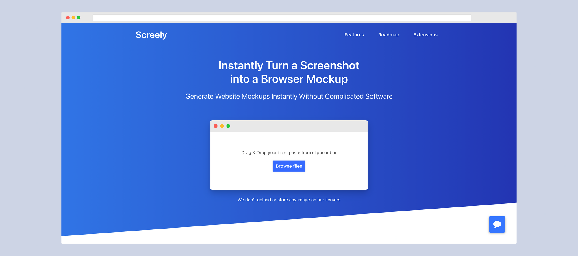
Screely allows you to transform boring screenshots into ones with a flare quickly. It’s meant to turn a screenshot into a browser mockup swiftly. It can also double up as a great way to make a screenshot look professional. An image without a background may look hastily taken and shared, but something with a background or browser added could look well thought out.
In my context, I am going to use Screely when I screenshot graphs or data in Google Analytics, Facebook Ads, or Google Ads. It’ll make those basic graphs borrowed from those websites look 10-times more professional.
Screely works two ways. There is a website and a Chrome Extension. The paid Chrome Extension is only $10, but worth the price. You press the extension, and it takes a screenshot of the visible page and opens the screenly website for you to edit the image. The other way is by going to the Screely website and directly uploading a screenshot or any image.
Either way, you go once the image is in the editor. You’re able to choose the background color, whether there is a browser. If the browser window is dark mode or light. There’s an option to include the MacOS buttons or not.


